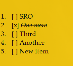
Notezilla has a cool ability to represent a sticky note as a checklist. Each line in a sticky note begins with a checkbox that you can tick off.

What is Notezilla?
Notezilla is a professional, elegant & highly rated sticky notes app for Windows & Phones (Android, iOS, iPhone, iPad etc). You can also access your sticky notes from a Mac.
Notezilla helps you organize various tiny bits of information you would need through out your life. It keeps all your notes, tasks & reminders handy where ever you are. With sticky notes, you hardly have to put effort to take notes, set reminders, etc. Quickly jot down & move on with your task at hand.
Here are some features of Notezilla:
- Sticky notes with reminders
- Attach sticky notes to websites, documents, folders & apps
- Organize sticky notes inside folders to keep your Windows desktop clean.
- Pin sticky notes on top of other apps
- Sync sticky notes between Windows, Android, iPhone, iPad
- Add pictures inside sticky notes
- Checklist sticky notes
- Lock sticky notes (password protect)
- Markdown support
- Send notes over local network (LAN) or across the globe
- Tag sticky notes
- Fully transparent sticky notes
- Dark mode
Watch a short video describing this feature:
For more tutorial videos, check out this page.
To enable this feature just right click inside a sticky note and choose Bullets & Numbering->Checklist from the menu.
Learn more about Notezilla
Subscribe to our YouTube channel for interesting videos.
Thanks for your time :)
The addition of the checklist feature was a truly OUTSTANDING development, and has made Notezilla a much more useful tool for me. Currently, when I check an item off, the text is italicized. Would it be possible to have the text struck-through, also (or instead of italicizing)?
Thanks Dennis,
We decided on italicized text because we observed that a struck-through text was much less readable and caused stress on eyes and brain.
Feel free to educate us if we are missing something.
Personally, I find that struck-thru text is less distracting than italicized text, since italics are often used to highlight text. Currently I go back and strike thru the text, anyway, since the strike-thru is an automatic mental jog to ignore. My opinion is that it is a poor use of italics to identify something as completed. It would be nice to have the option of selecting a personal preference as to marking a checked item.
Thanks Dennis,
We have taken note of your suggestion so that we can review it when we design the next version.
Another thing that would be nice is if the checked off items became grayed out so that as one looks down the list the difference between checked off items and those not checked off was more striking.
I’m missing option where ticked off items would be hidden – disappear as you tick them off.